Brand extension has become one of the most important strategic tools for growth in today’s highly competitive markets. A brand’s move beyond its existing product category into new segments is not merely a commercial decision, but also a process of perceptual repositioning. In this process, one of the most critical factors determining success is consistency in packaging design. When consumers encounter a new product, their first instinct is to determine whether it feels “familiar.”
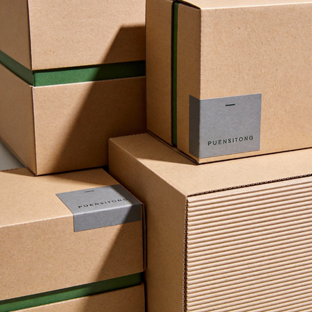
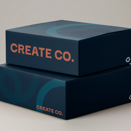
Packaging is one of the most visible carriers of brand memory. Color palettes, typography, visual language, material choices, and overall composition collectively shape a brand identity in the consumer’s mind. During brand extension, maintaining these elements helps the new product be easily associated with the existing brand family. Otherwise, consumers may fail to recognize it as part of the same brand, weakening trust and perceived credibility.
Consistency does not mean exact replication. On the contrary, it refers to maintaining a shared visual language within a flexible design system. For instance, while expanding into different product categories, a brand may preserve the same typographic system but use color variations to differentiate products. This approach preserves brand cohesion while also creating a structured hierarchy among products.
Visual hierarchy in packaging design plays a critical role in the success of brand extension. When a proper balance is established between core brand codes and product-specific distinctions, consumers explore new products within a familiar framework. This creates a significant advantage, particularly in fast-moving consumer goods and retail shelf environments.
Material and structural design also form part of this language of consistency. The same tactile experience, a similar unboxing process, or comparable form factors establish a physical connection between products. Consumers recognize the brand not only visually but also experientially. This makes brand extension more secure and more readily accepted.
However, excessive consistency also carries certain risks. If a new product fails to differentiate itself sufficiently, it may create category confusion for the consumer. Therefore, the principle of “difference within similarity” becomes a crucial balancing factor in packaging design. While maintaining brand identity, the product’s own value proposition must still be clearly communicated.
In the digital age, this consistency is no longer limited to physical shelves. Packaging must also remain recognizable on e-commerce platforms, mobile screens, and social media visuals. Smaller visual spaces require brand codes to become simpler, stronger, and more immediate. This leads to the elimination of unnecessary detail and the creation of a more streamlined visual system.
In summary, packaging consistency in brand extension is not merely an aesthetic preference but a strategic necessity. The success of new products largely depends on how quickly consumers experience the feeling of “I know this brand.” A familiar language reduces the perceived risk of something new and increases acceptance. For this reason, packaging design stands as one of the most powerful yet often invisible building blocks of successful brand extension.
At LuxBoxPack, we provide packaging solutions tailored to the evolving needs of our clients in different sectors. Contact us at +90 212 438 82 15 to get detailed information about our product range.