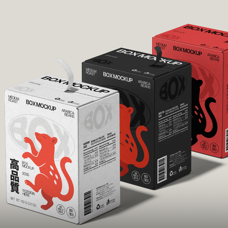
Packaging is one of the first physical points of contact between a product and the consumer. While colours, typography, graphic elements, and material choices create a strong first impression of the brand, product information, instructions for use, warnings, and legal statements are also integral components of packaging. For this reason, packaging design requires a balanced relationship between aesthetic considerations and regulatory obligations.
Across the food, cosmetics, pharmaceutical, cleaning, and many other industries, the information required to appear on packaging is determined by different regulations. Product ingredients, net quantity, expiry or best-before dates, manufacturer information, storage conditions, instructions for use, and various safety warnings are among these requirements. However, the mandatory nature of this information does not mean that it should be presented randomly or in a way that disrupts the overall design integrity of the packaging.
The first step in successfully incorporating regulatory language into packaging design is establishing a clear information hierarchy. It is important to determine which information consumers need to see at first glance and which details can be examined more closely. Font size, contrast, the use of white space, and typographic arrangement directly affect both readability and visual balance.
Particularly in minimalist designs, the volume of mandatory text can become a significant challenge. In such cases, making use of different surfaces of the packaging, grouping information logically, and using appropriate iconography can help create a more organized appearance. However, when symbols and visual shortcuts are used, the clarity and comprehensibility requirements set out in the relevant industry regulations must always be taken into consideration.
The harmony between brand aesthetics and legal requirements is also a matter of consistency. Mandatory information should not appear as a separate “additional text area” that is entirely disconnected from the brand’s core communication. While preserving the brand’s typographic character, colour palette, and overall design language, readability should never be compromised.
A successful packaging design does more than provide consumers with an eye-catching visual experience - it also communicates the information they need in a clear, accurate, and easily accessible manner. This balance between regulatory language and aesthetics enables packaging to become a stronger and more cohesive whole, both functionally and communicatively.
At LuxBoxPack, we provide packaging solutions tailored to the evolving needs of our clients in different sectors. Contact us at +90 212 438 82 15 to get detailed information about our product range.