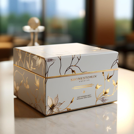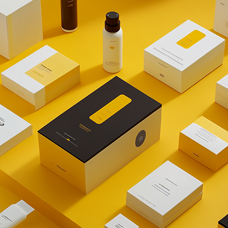
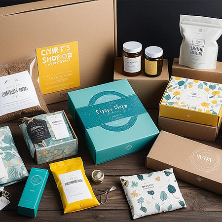
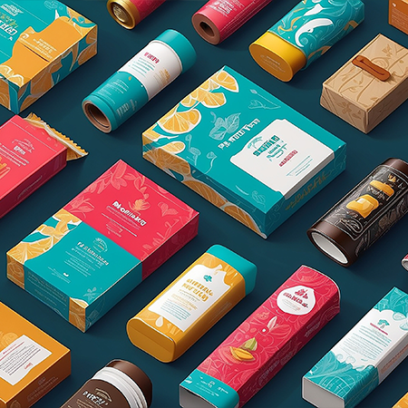
When a product is introduced to different countries and markets, the number of languages used on its packaging may also increase. While using multiple languages on the same surface makes it easier to communicate the necessary information to consumers, it also creates a new need for balance in the design. As the amount of text increases, the visual density of the packaging can become greater, potentially causing key information to get lost among other elements. For this reason, visual hierarchy in multilingual packaging should be approached not only as an aesthetic consideration but also as a matter of communication.
The primary purpose of visual hierarchy is to determine which information consumers perceive first when examining the packaging. The brand name, product category, product variant, key features, and usage information may each have different levels of importance. When multiple languages are used, presenting all of this information with equal emphasis and in the same arrangement in every language can create an unnecessary sense of repetition across the surface. Establishing the order of importance in advance therefore allows design decisions to be made in a more controlled manner.
Typography plays an important role in this process. Different languages can express the same word or phrase using different amounts of space. Since the same information may occupy different amounts of space in languages such as German, English, French, or Turkish, fixed text boxes may not always produce balanced results. The character structures and word densities of different writing systems can also affect readability. For this reason, font size, line spacing, weight, and the flexibility of text areas should be planned by considering different language versions together.
The use of colour and symbols can also help reduce the amount of linguistic content. Universally recognisable icons, usage instructions, or category markers can eliminate the need to communicate certain information solely through text. However, it is also important to consider that the meaning of symbols may vary across cultures. Rather than replacing written communication, visual elements should primarily support and reinforce it.
The positioning of information groups is another important consideration in multilingual packaging. Separating different languages clearly on the same surface can help consumers locate their preferred language more quickly. However, creating too many visual sections for different languages can make the design feel fragmented. The goal is not to conceal linguistic diversity, but to make that diversity visible within an organised and coherent system.
In short, successful multilingual packaging design is not about fitting as much information as possible onto a single surface, but about making the necessary information visible in the right order. As the number of languages increases, the importance of visual hierarchy also grows. Through a consistent typographic structure, balanced distribution of information, and supportive visual elements, content created for different markets can be brought together within the same communication system without compromising the overall integrity of the packaging.
At LuxBoxPack, we provide packaging solutions tailored to the evolving needs of our clients in different sectors. Contact us at +90 212 438 82 15 to get detailed information about our product range.