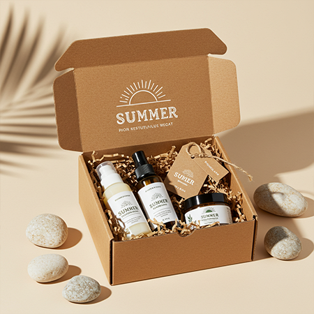
Packaging is the first point of contact between a consumer and a product. Especially for seasonal product groups, the design language of the packaging directly influences consumer perception. In this context, sun care products stand out with packaging designs that reflect the spirit and expectations of summer. From color choices to graphic details, from language use to symbols and motifs, numerous elements combine functionality with aesthetics in packaging.
The Psychological Impact of Colors:
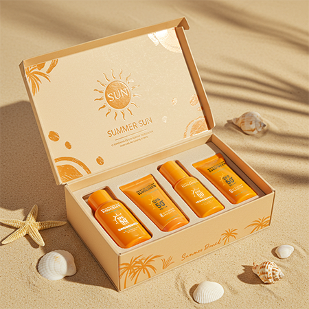
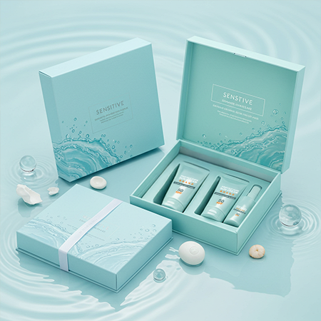
In the packaging of sunscreens, tanning products, or skincare items, colors that evoke the warmth and energetic atmosphere of summer are typically preferred. Orange, yellow, and light shades of blue are the most common choices in this category. While orange and yellow symbolize energy, sunshine, and vitality, blue tones create a sense of coolness and freshness. In recent years, the use of pastel tones has also become increasingly widespread. Soft blue, mint green, and light peach shades are often chosen for products targeting sensitive skin, as they evoke a calm and trustworthy impression.
Motifs and Graphic Elements:
The motifs used in packaging design help reinforce the product’s purpose or the feeling it intends to convey. Seashells, palm leaves, sun icons, and wave patterns are among the most frequently used graphic details on sun care products. Brands that adopt a minimalist approach tend to reinterpret these symbols in simple, modern forms, while more traditional designs highlight illustrative and detailed motifs.
Typography and Language Use:
In packaging design, not only visual elements but also typography and text play a crucial role. Recently, clean, highly legible, and minimalist fonts have been at the forefront. Packaging that clearly communicates product features and avoids unnecessary complexity instills a sense of trust in consumers. Furthermore, phrases that emphasize eco-friendliness, vegan formulations, or natural ingredients are increasingly integrated into packaging designs. That ensures that the brand’s values are perceived holistically through the design language.
In summary, suncare product packaging is designed not only with aesthetic concerns in mind but also as a tool to establish an emotional connection. These designs, which reflect the dynamic, energetic, and refreshing nature of summer, are most effective when they align with consumer expectations.
At LuxBoxPack, we provide packaging solutions tailored to the evolving needs of our clients in different sectors. Contact us at +90 212 438 82 15 to get detailed information about our product range.