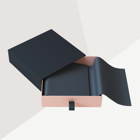
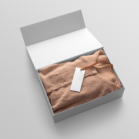
For many years, the concept of “luxury” in packaging design was associated with multiple visual layers, gold foils, dense typography, and rich color palettes. However, this understanding has been gradually shifting in recent years. Visual complexity is giving way to simplicity, and overt ornamentation is being replaced by a more intentional form of minimalism. One of the most striking expressions of this transformation is packaging designs built around a single color. But is it truly possible to tell a strong brand story using only one color?
The single-color packaging approach aims to increase perceptual depth while reducing visual diversity on the surface. The core idea is to eliminate distracting elements and bring design components such as form, texture, and typography into focus. Reducing the number of colors makes the design appear more “silent,” and this silence is often considered one of the fundamental components of luxury perception.
In luxury perception, simplicity is not merely an aesthetic choice but also a signal of control. The use of a single color represents a brand’s confidence in itself and its ability to communicate its message in a refined, restrained manner. Especially in premium segments, monochromatic approaches in black, white, cream, and deep tonal ranges are frequently preferred. However, the critical factor here is not the color itself, but how that color is executed.
In a single-color surface, the primary carriers of storytelling become other design elements. Contrasts between matte and glossy finishes, embossing details, varnish applications, and material selection replace visual variety with tactile richness. The user does not only see the package - they also feel it. This multisensory experience is one of the strongest advantages of monochromatic design systems.
Typography plays a crucial role in this approach. As color diversity decreases, typeface becomes a narrative tool. Serif or sans-serif choices, letter spacing, and font sizes directly reflect the brand’s personality. Within a minimal color palette, typography effectively becomes the voice of the story.
Another important advantage of single-color usage is perceptual clarity. Instead of decoding complex visual cues, the consumer focuses directly on the brand message. This creates a stronger impact, particularly for high-end products where the “less but better” philosophy is essential. However, when misapplied, this simplicity can lead to a sense of emptiness, making balance a critical design requirement.
Material selection is another fundamental element that completes the narrative in monochromatic packaging. The same color can evoke entirely different perceptions depending on the material it is applied to. For instance, dark tones on matte surfaces convey a more sophisticated feel, while the same tones on glossy surfaces appear more assertive and modern. Therefore, it is not the color alone but the holistic experience formed with the material that is being designed.
Single-color packaging design can also align with sustainability perception. Fewer printing layers, reduced ink usage, and simpler production processes can indirectly contribute to lowering environmental impact. However, for this approach to be truly considered sustainable, production processes must align with this philosophy beyond purely aesthetic considerations.
In essence, single-color packaging design represents an approach where meaning density takes precedence over visual variety. The story is no longer hidden in the abundance of colors but within the depth of simplicity itself. When properly executed, a single color can be sufficient to express a brand’s character, stance, and values. At this point, luxury is redefined: what matters is not showing more, but making the consumer feel more with less.
At LuxBoxPack, we provide packaging solutions tailored to the evolving needs of our clients in different sectors. Contact us at +90 212 438 82 15 to get detailed information about our product range.