In a retail environment, consumer behavior is shaped within seconds. Whether a product stands out on the shelf is often determined not by its technical features or price advantage, but by visual perception. The most powerful component of this visual perception is color. In packaging design, color is not merely an aesthetic choice - it is also a strategic tool that influences category positioning, brand affinity, and purchase decisions.
However, for color usage to be effective, two critical balances must be considered: the established visual codes of the category and the brand’s need for differentiation. Especially in highly competitive sectors such as fast-moving consumer goods, cosmetics, beverages, and personal care, each category creates an expectation in the consumer through its own color language. While white and blue tones in milk and dairy products reinforce perceptions of naturalness and purity, metallic and dark tones in energy drinks evoke dynamism and strength.
Moving completely outside these established codes may cause consumers to misunderstand the product or perceive it as “foreign” on the shelf. For this reason, color strategy in packaging design should be based not on breaking the category language entirely, but on reinterpreting it.
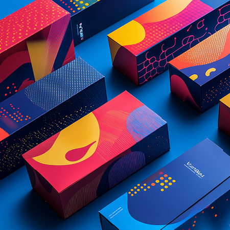
One of the most effective ways to differentiate without disrupting category codes is to create subtle distinctions through color tones. For example, if a category typically uses blue, a blue with warmer undertones or a palette supported by complementary contrast colors may be preferred. This approach both preserves a sense of familiarity and creates a visual “stopping point” on the shelf.
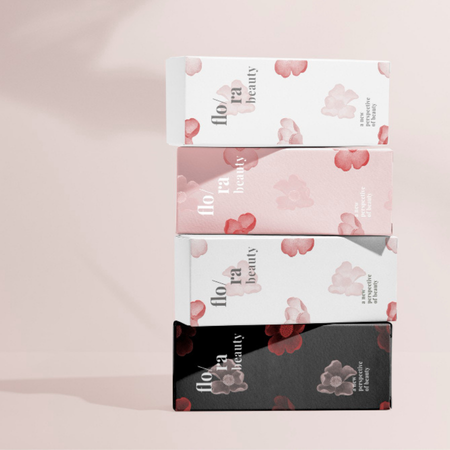
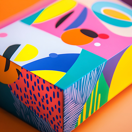
Another method is to restructure the color hierarchy. A color that is usually in the background within the category can be elevated to a primary accent color, creating a striking contrast. This technique not only facilitates the differentiation of variants within large product families but also preserves brand consistency.
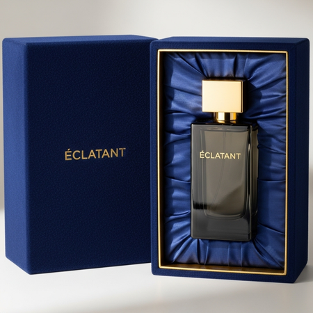
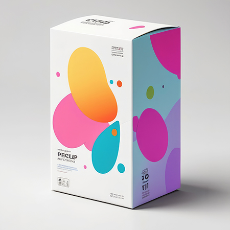
Minimalist color strategies have also been gaining increasing importance in recent years. In contrast to the visual clutter created by excessive color usage, brands working with a more limited palette can create a more premium and controlled perception on the shelf. Here, what matters is positioning simplicity not as invisibility, but as a deliberate design choice.
Color is also a powerful tool in terms of consumer segmentation. In products targeting different audiences within the same category, sub-segments can be clearly differentiated through color variations. In this way, consumers can more quickly identify the option that best suits their needs within the product family.
However, it should not be forgotten that color strategy alone is not sufficient. When combined with typography, material selection, surface texture, and form design, color becomes a much more powerful communication tool. Especially when used alongside tactile surfaces, color elevates the consumer experience to a multi-sensory level, not just a visual one.
In short, the use of color in packaging should be considered not a simple design decision, but a strategic field where shelf competition is managed. Understanding category codes and creating deliberate deviations within those codes provides brands with a significant advantage in terms of both visibility and consistency. A well-constructed color strategy not only captures consumer attention but also strengthens the brand’s mental positioning.
At LuxBoxPack, we provide packaging solutions tailored to the evolving needs of our clients in different sectors. Contact us at +90 212 438 82 15 to get detailed information about our product range.