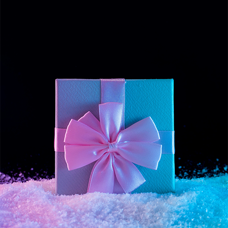
Winter is a season in which nature slows down, colors become more subdued, and tones gain a calmer identity. Using winter aesthetics as a robust reference in packaging design is not merely a seasonal choice; it stands out as a strategic approach that directly engages consumer psychology. The use of cool tones, particularly blue, gray, white, and ice-like textures, can create multiple effects on perception, emotion, and behavior.
Consumers often associate cool colors with concepts such as “cleanliness,” “simplicity,” “purity,” and “reliability.” For this reason, packaging languages inspired by winter aesthetics are frequently preferred for products focused on health, technology, care, and hygiene. A cool palette creates the impression that the product is functional, orderly, and controlled. Especially when combined with minimal typography, it forms a cohesive expression that reinforces perceptions of simplicity and professionalism.
Winter tones not only evoke a sense of emotional coolness but also offer an effective way to stand out on the shelf. Within a category dominated by warm hues, the use of a calm blue or frosted gray creates visual contrast. This contrast establishes a quiet yet assertive presence that draws consumer attention without shouting. Thus, winter aesthetics can be viewed as a strategy for standing out in highly competitive visual categories.
The use of cool tones in packaging can also strengthen perceptions related to product freshness. In the food sector, design elements that evoke ice or snow intuitively convey that the product is preserved, refreshing, and reliable in terms of shelf life. That is particularly effective for brands aiming to create a “freshness perception” without relying on cold-chain logistics.
Another aspect of incorporating winter aesthetics into packaging is its power to create an emotional atmosphere. Winter is associated with feelings such as calmness, clarity, stillness, and sometimes nostalgia. Cool tones and simple compositions used on packaging can open the door to these emotions in the consumer’s mind. In this way, the product goes beyond being merely a functional object and offers a mood-based experience.
In short, winter aesthetics in the world of packaging is not just a seasonal trend but a design approach that influences consumer behavior, shapes perception, and offers brands both aesthetic and strategic advantages. Cool tones are powerful tools that intuitively convey simplicity, trust, freshness, and professionalism. When used correctly in packaging design, they hold the potential to create a striking and lasting communications impact.
At LuxBoxPack, we provide packaging solutions tailored to the evolving needs of our clients in different sectors. Contact us at +90 212 438 82 15 to get detailed information about our product range.