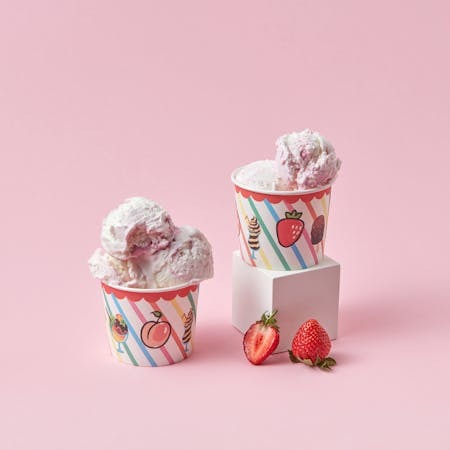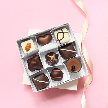
Packaging today is not merely a functional tool to protect the product; it is also a communication surface that carries the brand’s message. The typography (fonts) used on this surface -which conveys the product’s identity, quality, and even value at first glance- ensures that the message is delivered accurately and effectively. In this context, choosing a font in packaging design is more than an aesthetic decision - it is a strategic choice. So, what should be known before selecting a typeface for packaging?
The Font Is Like the Brand’s Voice:
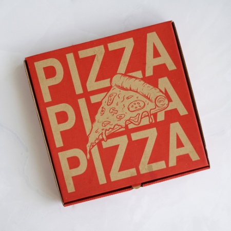
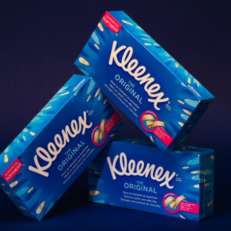
Each font carries a different spirit. Serif fonts (for example, Times New Roman) create a traditional, serious, and trustworthy impression, while sans-serif fonts (such as Helvetica) offer a more modern, simple, and approachable appearance. Handwritten-style characters can evoke a warm and personal effect. The font on the packaging reflects how the brand wishes to establish its relationship with the consumer.
Readability Comes Before Aesthetics:
Although visual appeal is significant in packaging design, the primary function of the text is readability. To stand out quickly among dozens of products on the shelf, the message must be instantly perceived. Therefore, avoiding overly complex or ornate fonts and ensuring clear visibility through appropriate letter spacing and font size is essential.
Hierarchy and Layers of Information:
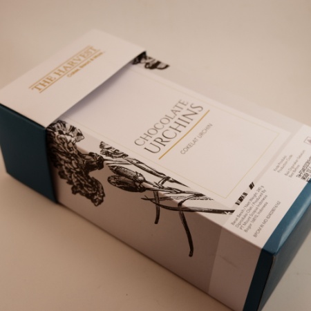
Packaging design includes many textual elements besides the product name, such as ingredient information, usage instructions, and legal warnings. Presenting all these elements in the same font causes confusion and makes directing attention difficult. To establish hierarchy, different weights (bold, regular, light) within the same font family can be used, or different but harmonious typefaces can be chosen to create contrast.
Language and Character Support:
For global brands, it is crucial that the font supports characters from various languages. A font lacking Turkish characters (ç, ğ, ö, ş, ü), for example, can make the brand appear unprofessional. Therefore, licensed fonts that offer multilingual support should be preferred.
Compatibility With Printing and Production Processes:
Some fonts look good digitally but may cause issues during printing. Fonts with thin lines can appear faded at low resolutions, and fonts with tightly spaced letters can lose clarity. Font selection should be considered alongside the printing technique to be used.
In summary, typography in packaging design is not just a choice of font; it is a fundamental element that shapes the product’s identity, reflects brand value, and sets the tone of the relationship with the consumer. Being conscious and strategic when selecting a font is the key to creating an aesthetic, functional, and holistic packaging design.
At LuxBoxPack, we provide packaging solutions tailored to the evolving needs of our clients in different sectors. Contact us at +90 212 438 82 15 to get detailed information about our product range.