For brands operating in the luxury segment, packaging serves not only to protect the product but also to reflect the brand’s identity, values, and aesthetic approach. Color and tone choices in premium packaging directly influence consumer perception, acting as a key element in reinforcing the product’s “luxury” appeal. So, which colors and tones are most prominent in this realm?
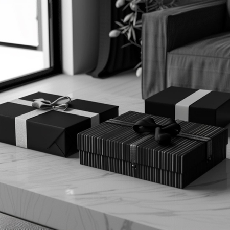
Traditionally, black and white emerge as the quintessential duo in luxury packaging. Black conveys sophistication, strength, and timelessness, while white represents simplicity and elegance. When combined with minimalist designs, these colors effectively communicate prestige and quality in high-end products. Black packaging is particularly common in jewelry, watches, and fashion, often accented with metallic tones such as gold or silver to highlight logos or design details.
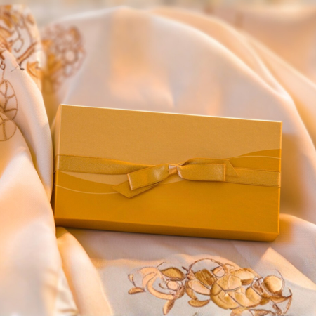
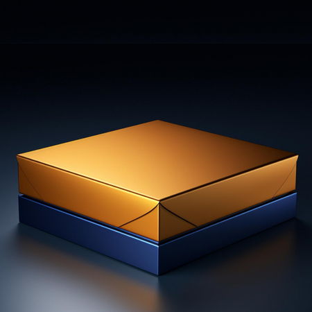
Metallic tones -gold, silver, and bronze- are another prominent element in luxury packaging. These colors impart a sense of value and exclusivity while ensuring that the packaging stands out on the shelf. Metallic accents are typically applied sparingly and strategically rather than across the entire package, creating visual appeal without appearing excessive.
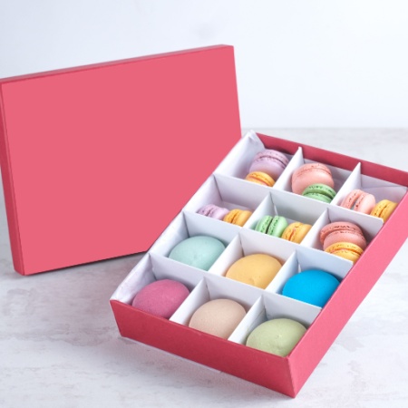
Premium brands also skillfully incorporate pastel shades. Soft beiges, cream tones, and blush pinks are especially prevalent in cosmetics and perfumery. These colors reinforce the perception of a delicate, high-quality product and contribute to a sophisticated appearance. The combination of the packaging material’s texture with the color palette engages both touch and sight, further enhancing the sense of luxury.
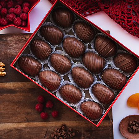
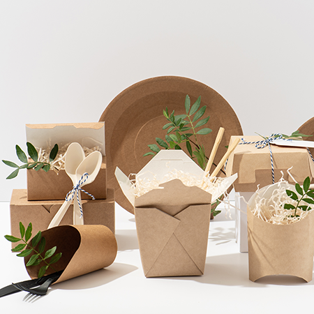
In recent years, neutral and earthy tones have increasingly appeared in luxury packaging. Browns, stone grays, and cream shades are often chosen by brands emphasizing sustainability and natural values. Using these tones signals that the brand aligns not only with aesthetics but also with principles and lifestyle choices.
In short, the dominant colors and tones in premium brand packaging typically consist of a carefully curated mix of black, white, metallic, pastel, and neutral shades. Each selection is made with precision to reflect the brand identity, the quality of the product, and the desired emotional response in consumers. In luxury packaging, colors do more than appeal visually: they act as the very language of sophistication.
At LuxBoxPack, we provide packaging solutions tailored to the evolving needs of our clients in different sectors. Contact us at +90 212 438 82 15 to get detailed information about our product range.
