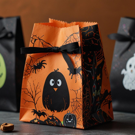
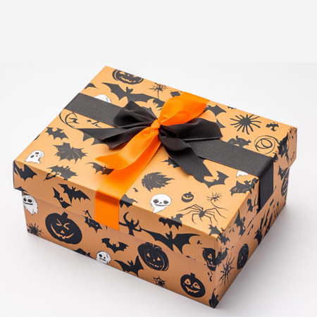
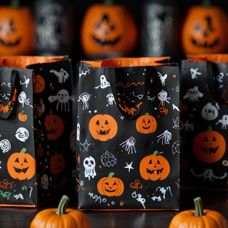
Halloween is one of the special occasions when visual identity takes centre stage. However, using thematic colours such as orange, black, or purple alone is not enough when designing packaging for the season. Packaging that establishes a stronger connection with consumers creates a sensory sense of unity in which colour, texture, typography, and storytelling work together in harmony.
Creating an Atmosphere Through Colour
In Halloween packaging, colour selection plays a direct role in creating an atmosphere. Black can evoke mystery and the theme of night, orange can suggest warmth and an autumnal feeling, while dark purple can create a fantastical and unconventional atmosphere. However, the contrast between colours is just as important as their intensity.
For example, limited orange details against a matte black background can create a more sophisticated appearance than a highly saturated colour palette. Using colours in a controlled manner helps reinforce the theme while preventing the design from becoming visually overwhelming.
Bringing the Sense of Touch Into Design
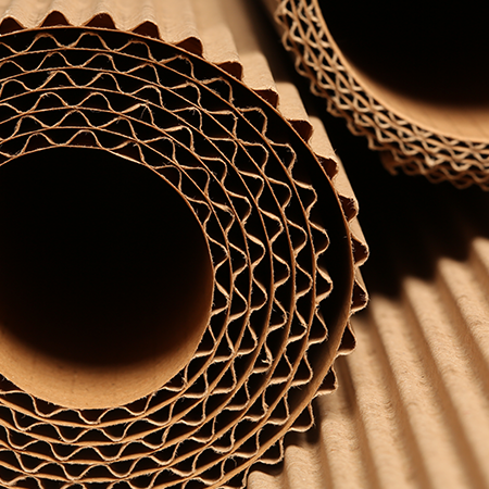
Texture is another important element of sensory design. The physical surface of packaging can support the visual message and create a distinct perception for the consumer. While matte surfaces can evoke a more mysterious and understated feeling, embossing, variations in lamination, and textured papers can add physical depth to the design.
Glossy finishes, when used selectively, can help certain graphic elements stand out. In this way, packaging becomes not only something to be seen, but also a communication medium that can be experienced through touch.
Design That Completes the Story
For the Halloween theme to be effective, the different elements of the packaging need to tell the same story. Rather than using a spider web simply as a decorative graphic, supporting it with typography, illustrations and colour can create a more meaningful visual world.
The aim is not to use as many symbols as possible, but to create a consistent atmosphere with a limited number of carefully selected elements. Maintaining the same visual language from the front of the package through to the opening experience creates a more cohesive story in the consumer’s mind.
In summary, sensory design in Halloween packaging requires colour, surface, and storytelling to be treated not as independent elements, but as parts of the same narrative. Successful design does more than simply communicate the theme - it can make the consumer feel a particular atmosphere.
At LuxBoxPack, we provide packaging solutions tailored to the evolving needs of our clients in different sectors. Contact us at +90 212 438 82 15 to get detailed information about our product range.