Packaging design is not only a technical element that protects a product but also one of the most important tools for establishing the first visual connection with consumers. However, aesthetic perception is not universal. A packaging design that is considered eye-catching and trustworthy in one region may be perceived as complex, ordinary, or insufficient in another. Cultural habits, consumer behavior, shopping experiences, and visual preferences all contribute to differences in expectations for packaging aesthetics from one country -and even one region- to another. For brands operating in international markets, packaging design is therefore not merely an aesthetic choice but also a strategic process of adaptation.
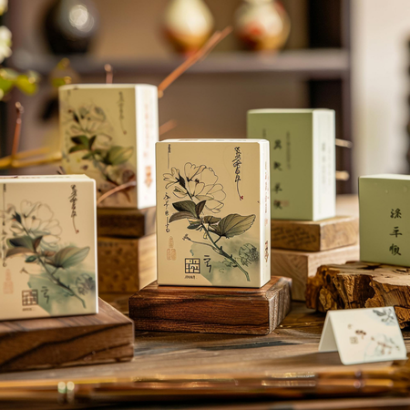
In Asian markets, packaging often stands out through the use of vibrant colors, dense graphic elements, and detailed product information. Particularly in countries such as Japan, South Korea, and China, consumers tend to respond positively to packaging that provides comprehensive product information, incorporates visually striking elements, and is easily noticeable on retail shelves. Limited shelf space and a high level of product variety are among the factors that encourage more dynamic and visually rich designs. In markets where gift-giving culture is deeply rooted, the aesthetic value of the packaging may even be considered as important as the product itself.
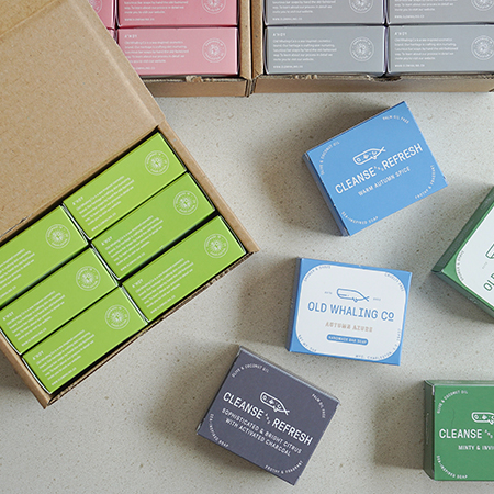
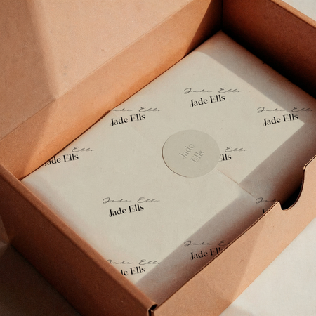
In North America, simplicity and functionality take precedence across many product categories. Consumers tend to prefer packaging that allows them to quickly understand the product’s key features, uses readable typography, and presents information with a clear visual hierarchy. While minimalist design has gained particularly strong acceptance in the premium segment, communicating messages about a product being natural, organic, or environmentally friendly through a clean visual language can also reinforce the perception of trust.
Although the European market exhibits considerable diversity in aesthetic preferences, it generally stands out for its balanced design approach. In many European countries, consumers expect a balance between functionality and visual simplicity. While unnecessary visual clutter is avoided, information about the product’s origin, ingredients, and sustainability attributes is presented clearly and understandably. Natural colors, matte finishes, and simple graphics that evoke recyclability are particularly well received across many product categories.
In Middle Eastern markets, a premium appearance is often associated with more elaborate design elements. Gold tones, glossy finishes, rich patterns, and strong color contrasts are among the aesthetic approaches frequently preferred, particularly in cosmetics, food, and gift product categories. Incorporating regional cultural motifs into the design can also help establish a stronger connection with consumers.
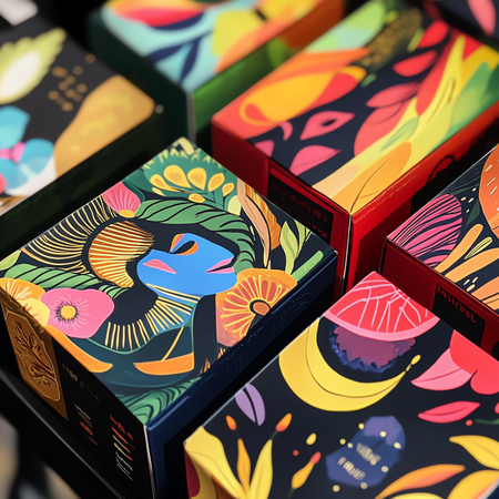
In Latin America, warm color palettes, energetic graphics, and designs that convey a sense of movement attract attention across many product categories. This dynamic visual language helps consumers notice products more easily on retail shelves, while the vibrant appearance of the packaging can be associated with the product’s freshness and energy. At the same time, economic conditions and consumer habits in different countries are also among the important factors influencing expectations for packaging.
Color preferences provide one of the clearest examples of regional differences. While the color white may evoke feelings of purity and hygiene in some markets, it can carry different symbolic meanings in other cultures. Similarly, colors such as red, black, and gold may represent luxury, luck, strength, or other emotional associations depending on the cultural context. For this reason, packaging designed for international markets takes into account not only aesthetic preferences but also the cultural meanings associated with colors.
Typography, visual density, and the way information is presented are also important design elements that influence consumer expectations. In some markets, detailed explanations help build trust, while in others, simple and quickly readable messages are more effective. Likewise, the icons, symbols, and visuals used on packaging may not be interpreted in the same way across different markets due to cultural differences.
In summary, packaging aesthetics is one of the design fields that cannot easily be standardized across global markets. Geographic location, cultural values, consumer habits, and local purchasing behavior all directly shape the visual language expected from packaging. Accurately analyzing regional expectations is regarded as an important design approach for both increasing a product’s visibility on the shelf and establishing a stronger, trust-based first impression with consumers.
At LuxBoxPack, we provide packaging solutions tailored to the evolving needs of our clients in different sectors. Contact us at +90 212 438 82 15 to get detailed information about our product range.